
Visual Hierarchy in Design: Balancing Form and Function
Visual hierarchy is fundamental for combining design skills with the message you want to convey, guiding your audience through your work.
The Crucial Role of Typographic Hierarchy
Typographic hierarchy is one of the most effective (and simplest) ways to visually organize a design. In fact, this technique has been used for centuries, as seen in the front page of the New York Times reporting on the sinking of the Titanic (1912):
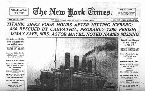
Historical Example:
- Level 1 (Main Headline): “TITANIC SINKS FOUR HOURS AFTER HITTING ICEBERG…” (all caps, largest font size)
- Level 2: Subheading with key details (smaller font)
- Levels 3-4: Supplementary information (progressively smaller text)
This approach not only captured attention at newsstands but also organized information from most to least important—a principle still valuable in digital design today.
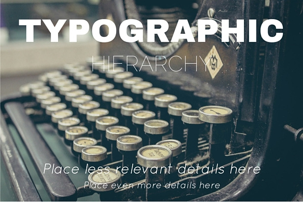
How to Improve Your Designs with Typographic Hierarchy
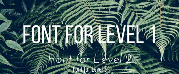
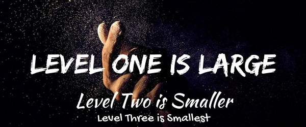
The 3 Essential Levels:
- Level 1 (Headline):
- Introduces the main topic
- Uses the largest font size (e.g., blog titles)
- Level 2 (Subheading):
- Adds important details
- Second-largest font size
- Level 3 (Body):
- Extended content or lower-priority information
- Smaller text (e.g., article body)
Techniques for Applying Visual Hierarchy
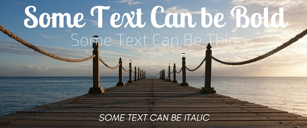
- Contrasting Typefaces:
- Combine different fonts for each level (e.g., sans-serif for headlines + serif for body text).
- Size:
- The most straightforward tool: the most important text should be the largest.
- Style and Weight:
- Strategically use bold, italic, or uppercase to emphasize information.
- Color:
- Color contrast draws the eye (e.g., white text on a dark background).
- Orientation:
- Slanted or vertical text breaks monotony (ideal for creative headlines).
- White Space:
- “Negative space” around text improves readability and focus (e.g., minimalist designs).
Why Does It Work?
In an age of constant distraction, visual hierarchy helps:
- Stand out in crowded feeds (social media, online stores)
- Guide users to key information
- Enhance reading experience and retention
Key Insight: NNGroup research confirms users scan pages in “F” or “Z” patterns, making hierarchical layouts optimize this natural behavior.
Modern Example:
Imagine a Spotify promotional banner:
- Level 1: “NEW ALBUM” (bold, 60px, neon color)
- Level 2: “Artist: [Name]” (40px, dark gray)
- Level 3: “Available now” + CTA button (20px, white)
Conclusion:
Mastering typographic hierarchy transforms functional designs into strategic pieces that communicate clearly and perform better. Whether for social media, websites, or print materials, these principles ensure your message won’t be overlooked.